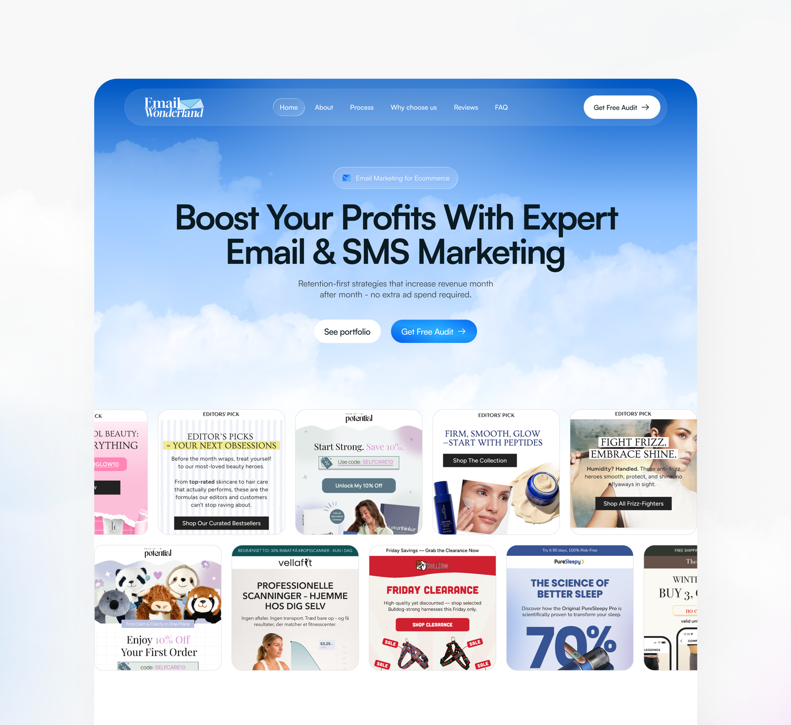
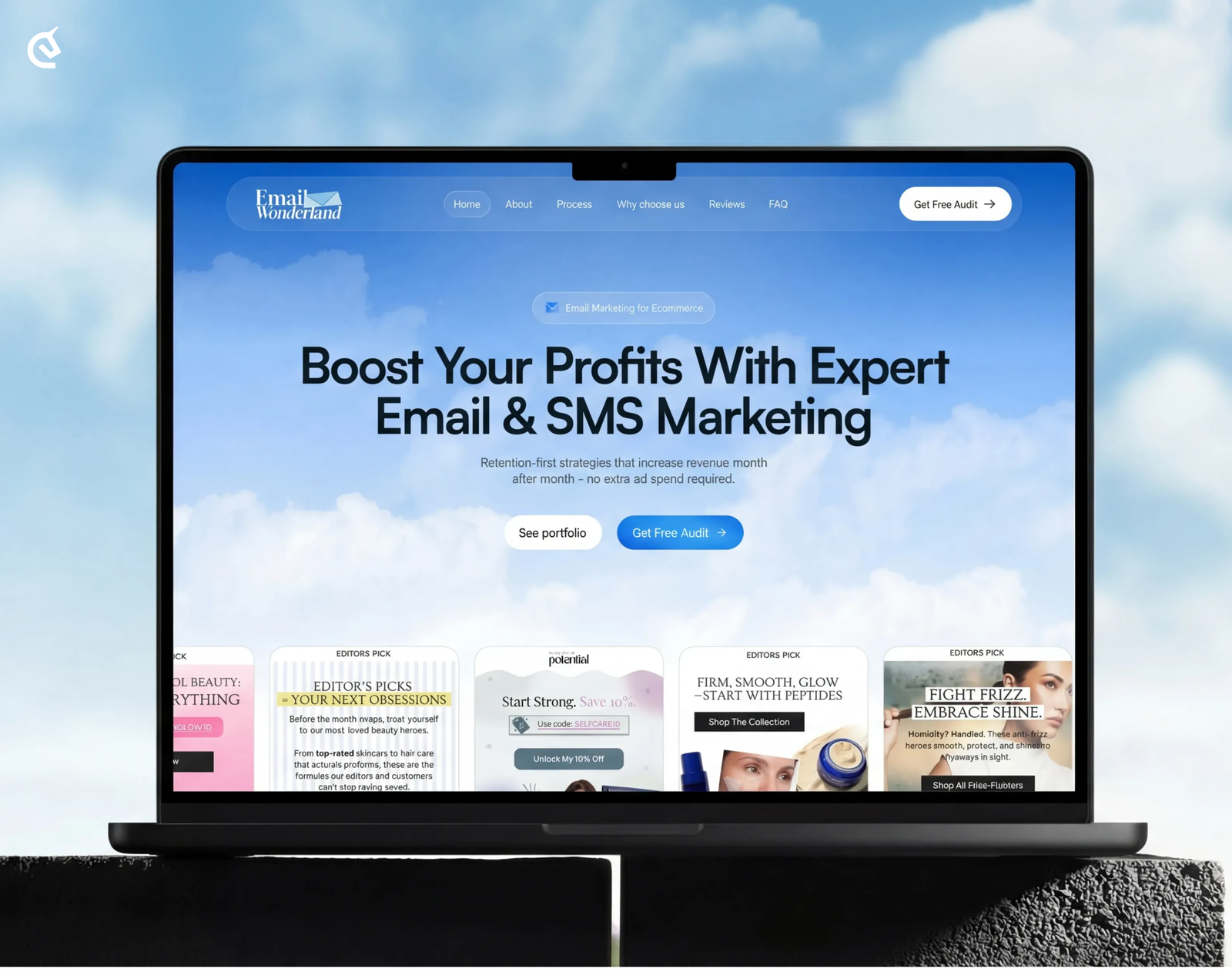
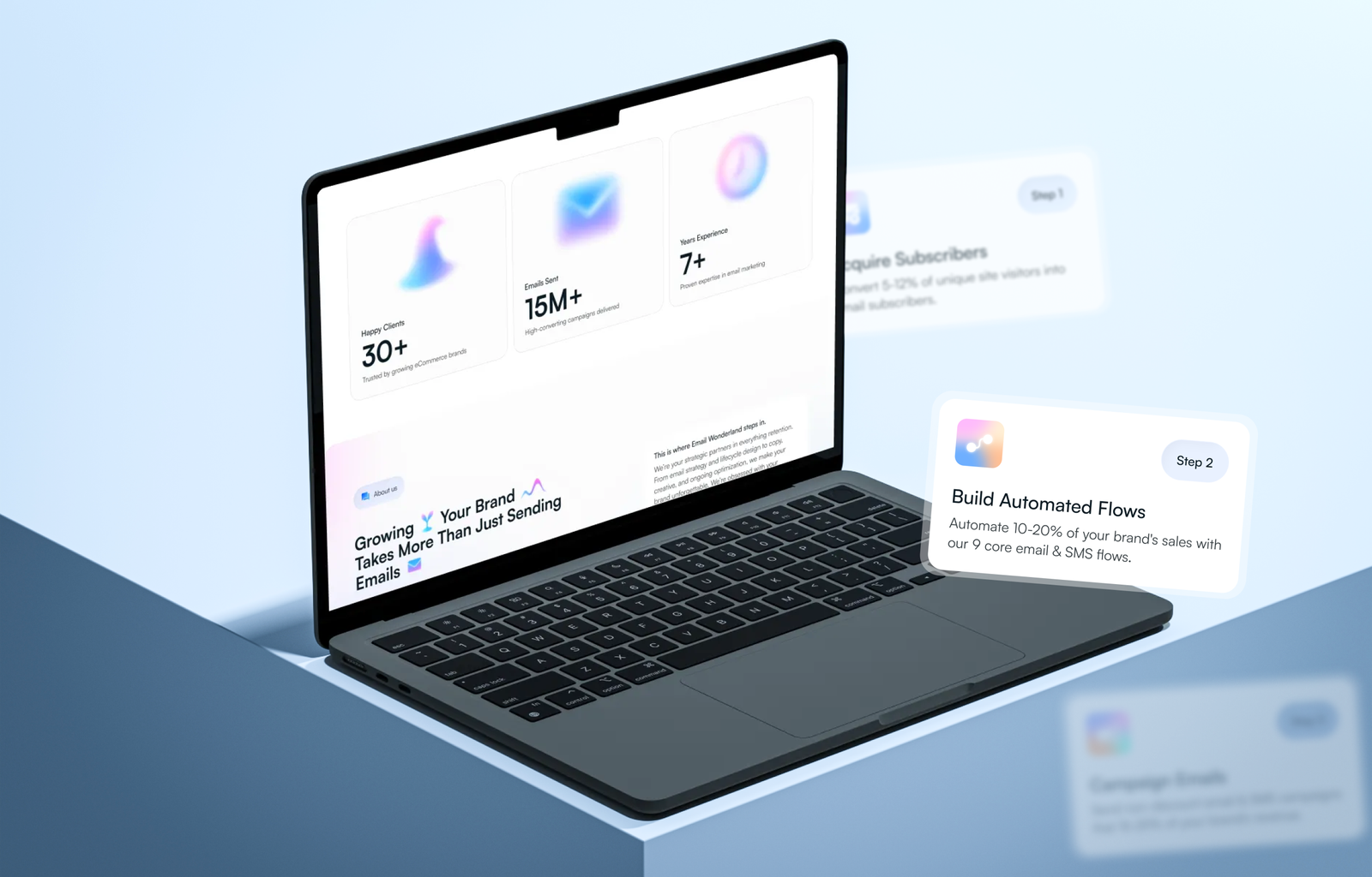
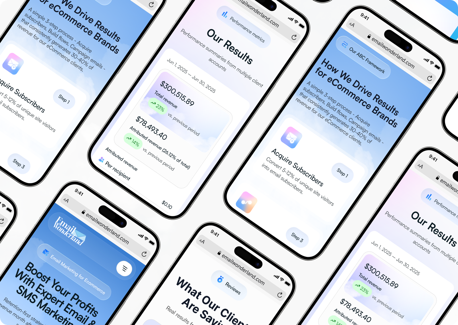
Email Wonderland

  • Web Design
  • WordPress Development
Email Wonderland

Email Wonderland your strategic partner in everything retention.

The design strategically emphasizes their core message while providing a seamless browsing experience for visitors.

Title

Task

Create a landing/presentation website for an email marketing & automation agency that increases trust and conversion into applications by making the results of the service clear from the first screen — through visual examples and a structured explanation of the process.

Title

Challenge

The main difficulty lies in the fact that email marketing is perceived by many business owners as a simple or even outdated service that is difficult to evaluate until the first reports are received.

Results

We developed a comprehensive ecosystem that works to deconstruct customer skepticism through every visual and structural element. Instead of simply describing the services in text, they “materialized” the result by placing a gallery of high-quality letter layouts on the main screen, which instantly removes any questions about the level of design and content.

Screens:
12
Hours:
100+
Team members:
10+

Project Timeline

  • Research

    We reviewed top eCommerce email/SMS agencies and audit-style landing pages to identify what builds trust fastest. We mapped common objections (cost, “template work,” unclear ROI) and defined what content must be shown above the fold to convert.

  • Briefing

    We aligned on the primary goal: turn cold traffic into “Free Audit” requests. We defined key messages (profit growth, retention-first, no extra ad spend), proof requirements (portfolio + reviews), and constraints for speed, readability, and scalable sections.

  • Wireframes

    We built a conversion-first structure: hero → proof/portfolio → process → services → reviews → FAQ → CTA. Layout and hierarchy were tested to make the next step obvious and keep users moving with minimal scrolling friction.

  • UX Research

    We identified core audiences (store owners, retention marketers, agencies) and their decision drivers: credibility, clear deliverables, and quick time-to-value. Based on this, we prioritized trust blocks, scannable benefits, and a “see the work” path within the first screen.

  • Moodboard

    We curated an “airy, friendly, premium” direction: soft gradients, clean typography, and calm color transitions to feel approachable but professional. The mood aimed to reduce skepticism and make the brand feel modern, organized, and results-driven.

  • Design Concepts

    We explored multiple hero directions: portfolio-first, audit-first, and results-first. We iterated toward a concept that balances a bold headline with immediate proof (real email examples) and a clear primary CTA, keeping the page light and easy to scan.

  • UI Design

    We designed a cohesive UI system (type scale, spacing, buttons, cards, and states) optimized for responsive layouts. The final UI supports fast loading, strong CTA visibility, and a portfolio grid that communicates quality instantly without overwhelming the user.

Research
User Flow
Wireframes
UI Concepts
UI Design
UI kit
Closing

Title

Title

Let`s discuss where you want to get

Taras Oliinyk Photo

Taras Oliinyk

CEO at U1CORE

Book an introduction call

During this call we do a quick intro and discuss your project and its specific needs.

Tell us more about your project

Share your project details with us, and we'll respond promptly.