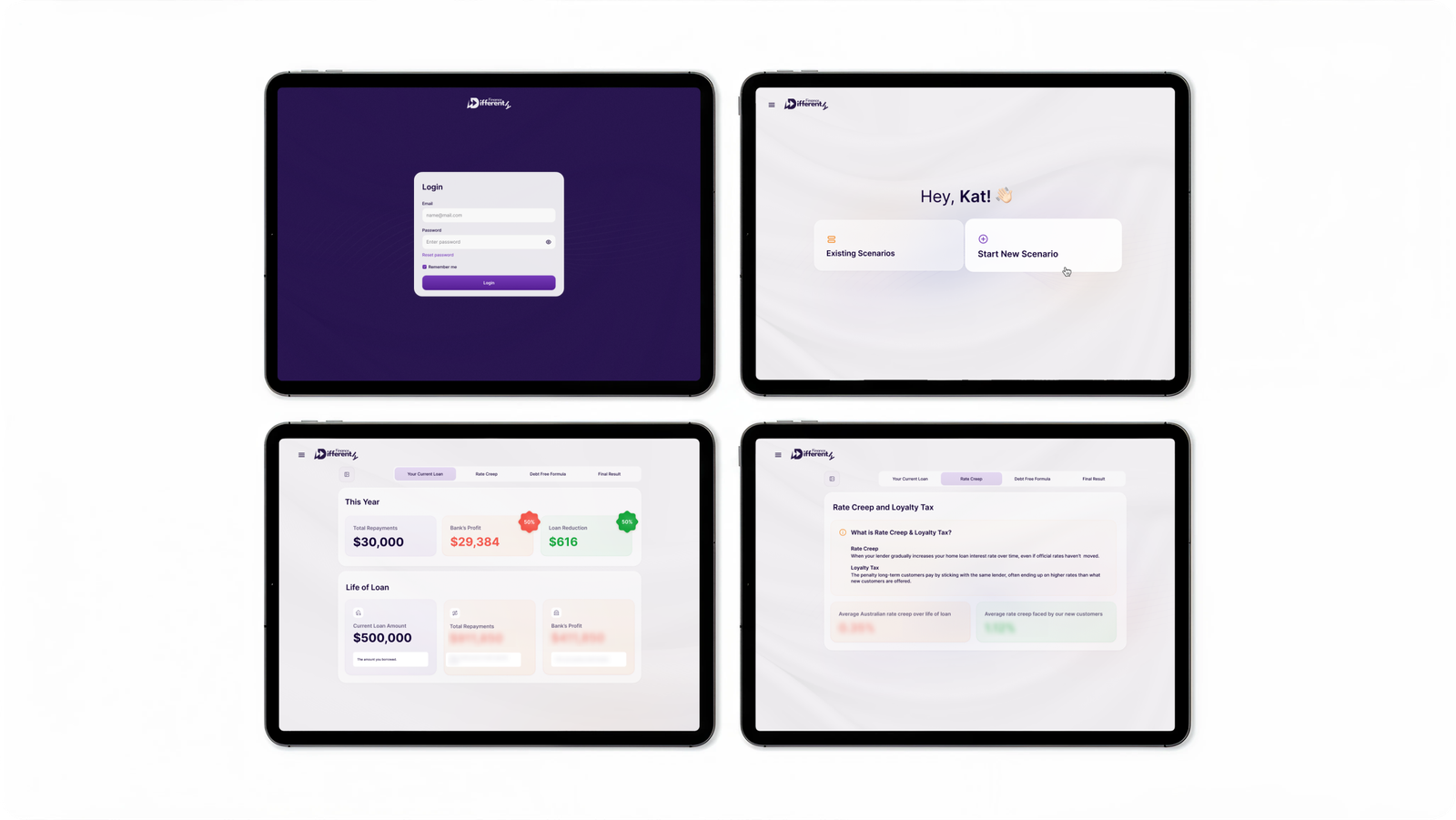
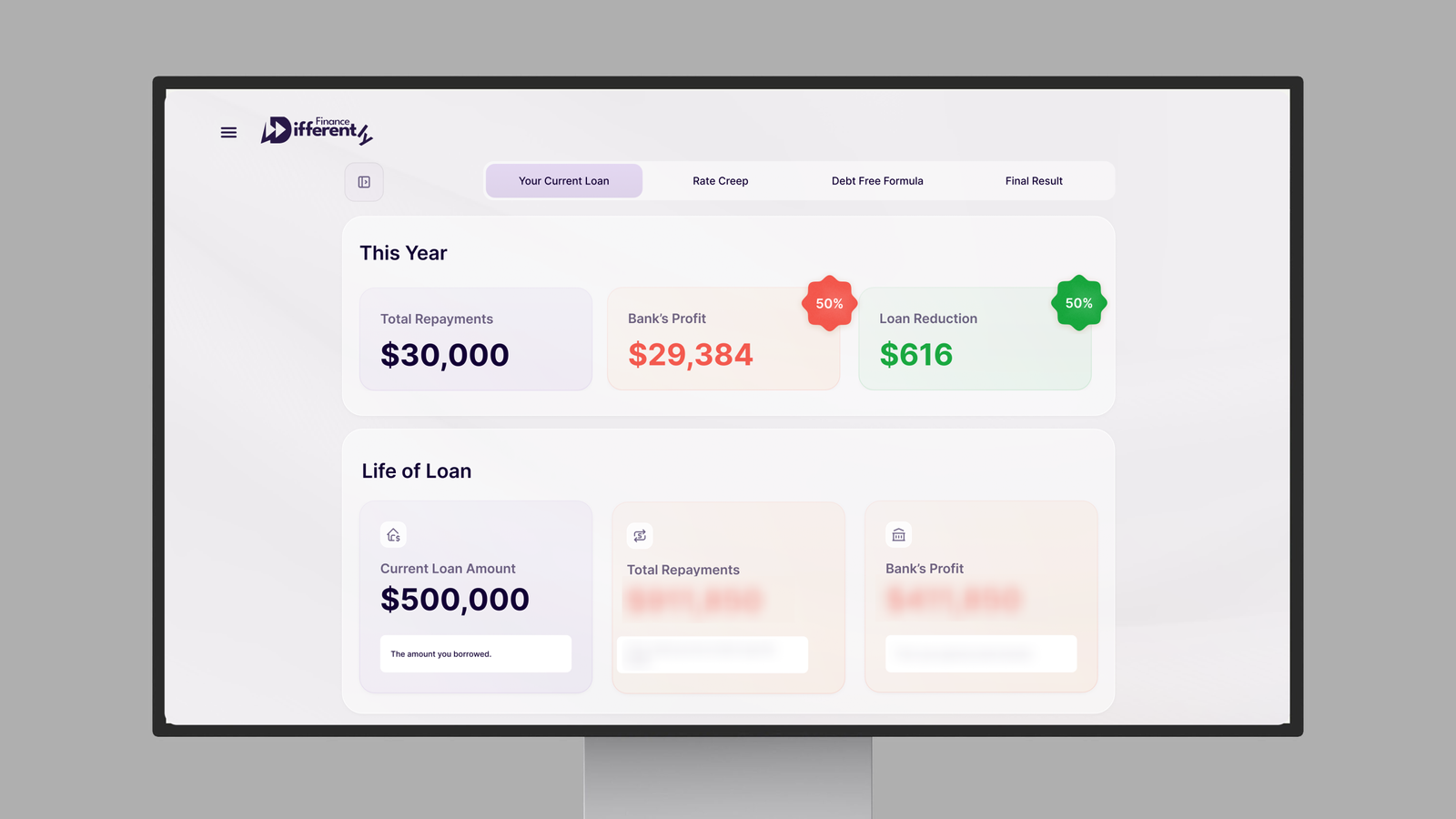
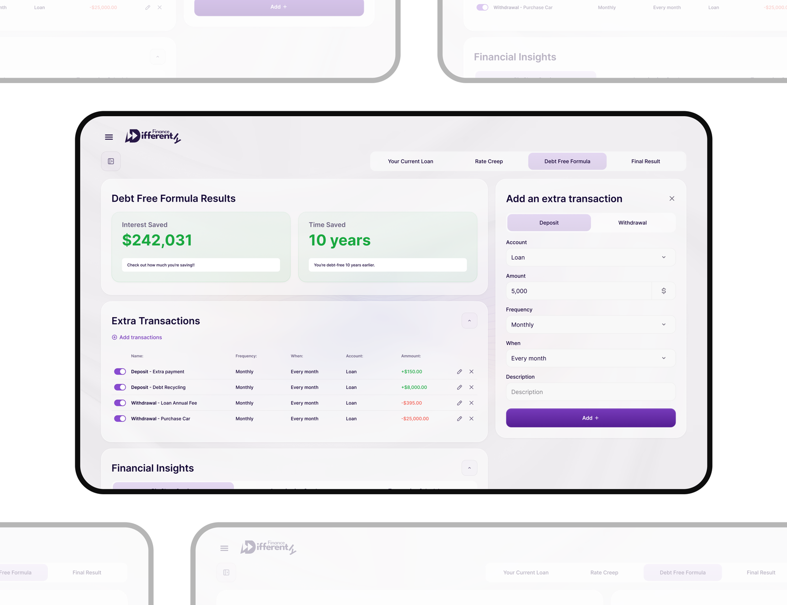
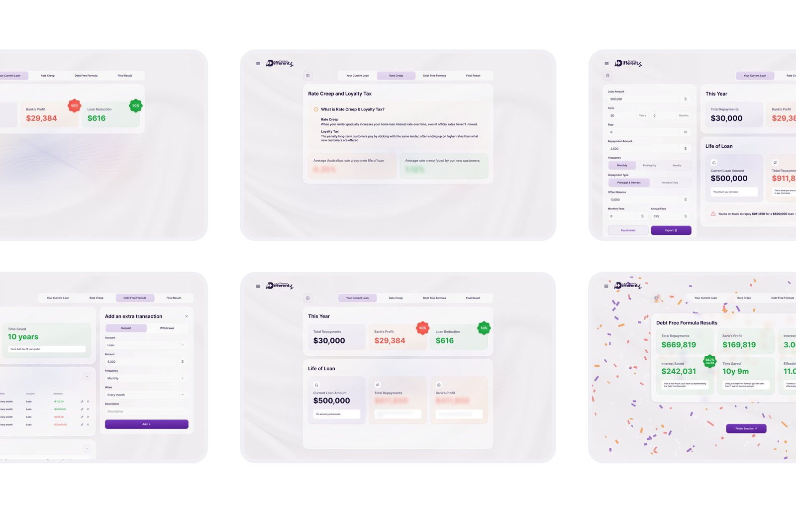
Finance Differently

  • UI/UX Product Design
  • Custom Software
Finance Differently

The Loan Calculator website is a sleek, user-friendly platform designed to help users easily calculate and manage their loans.

Whether for personal or business use, this tool makes understanding loan details simple, empowering users to make informed financial decisions effortlessly.

Title

Task

Our task was to design a modern and clean desktop calculator for a FinTech platform, focusing on maximizing accessibility and ensuring ease of use for users across all age groups. The goal was to develop an interface that was intuitive and user-friendly, allowing users to easily input data and view results in a structured format.

Title

Challenge

The main challenge in this project was ensuring the calculator would be easy to use for users of all ages and experience levels, particularly considering the complexity often associated with financial calculators.

Results

The project involved creating new functionality, including redesigned elements such as a logo update. The work focused on the desktop UI/UX design of a highly interactive element — a calculator — which served as the central functional core, designed to ensure high engagement and conversion.

Screens:
80+
Hours:
120+
Team members:
10+

Project Timeline

  • Research

    We conducted a thorough analysis of the FinTech industry, focusing on competitors’ calculators and understanding how users engage with financial tools. This research included studying various design elements, functional components, and user behaviors specific to online financial calculators.

  • Briefing

    We aligned with the client to define the project goals, including improving user experience and ensuring high conversion rates. The primary objective was to create a financial calculator that was visually appealing, simple to use, and catered to users of various age groups.

  • Wireframes

    We created wireframes to establish the layout, ensuring each element had its place in a clean, intuitive design. The wireframes focused on clear paths for users to input their financial information, receive results, and explore additional insights.

  • UX Research

    To understand how users interact with financial tools, we gathered insights through surveys, user interviews, and competitor analysis. This research helped us pinpoint common pain points and the most important features users expect from financial calculators.

  • Moodboard

    The moodboard was designed to set the tone for the project, combining clean, modern aesthetics with a sense of trust and professionalism. We used a color palette of soft, neutral tones with accents of vibrant colors to highlight key elements like buttons and data results.

  • Design Concepts

    We explored several design directions that balanced a professional FinTech feel with a visually engaging interface. One of the key design concepts featured clean layouts with ample white space, ensuring clarity and readability.

  • UI Design

    The final UI design focused on creating a seamless, intuitive experience for users. We integrated strong typography, a clear visual hierarchy, and prominent CTAs to guide users effortlessly through the tool. The design used dynamic input fields, intuitive navigation, and visually engaging graphs and tables to present financial data in a digestible format.

Research
User Flow
Wireframes
UI Concepts
UI Design
UI kit
Closing

Title

Title

Let`s discuss where you want to get

Taras Oliinyk Photo

Taras Oliinyk

CEO at U1CORE

Book an introduction call

During this call we do a quick intro and discuss your project and its specific needs.

Tell us more about your project

Share your project details with us, and we'll respond promptly.