Conduct a comprehensive UX audit to identify usability issues and inefficiencies, then redesign the interface to improve clarity, user flows, and overall ease of use—ensuring a more intuitive and efficient experience for users.
ECHO LIVE
ECHO LIVE is a global content creation and sharing platform with capability above and beyond anything you’ve seen before.
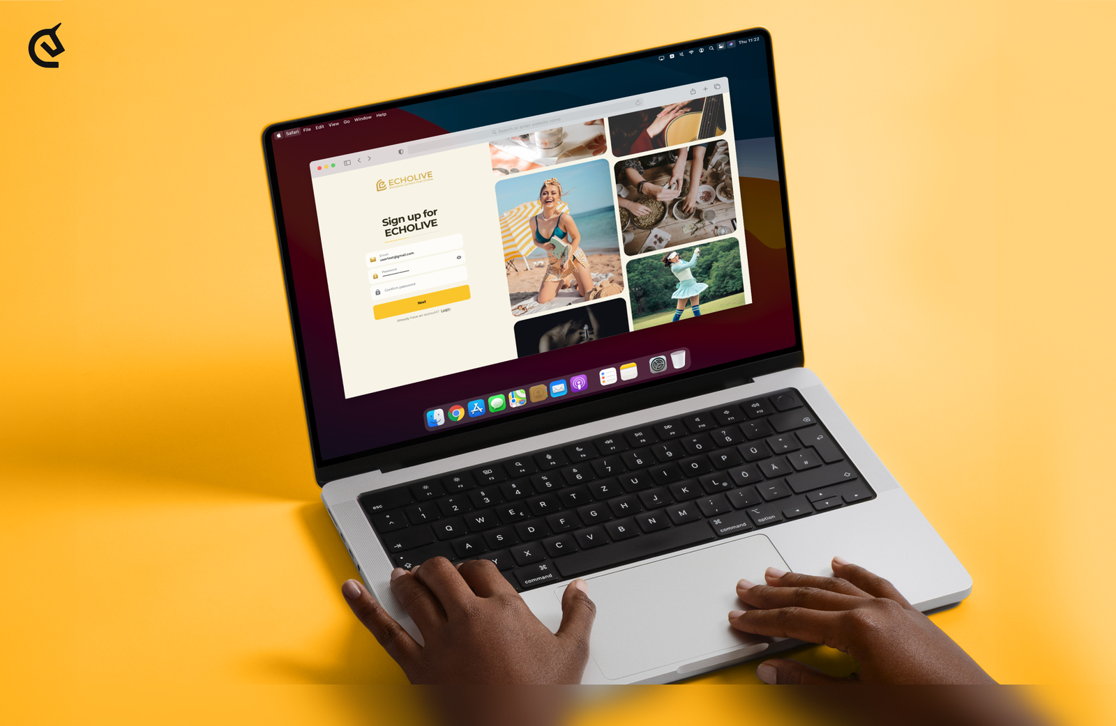
The client approached us with a need to improve the user experience and interface on their platform.
Title
Task
Title
Challenge
The client approached us with a need to improve the user experience and interface on their platform. Our task was to conduct a UX audit and identify the main issues in order to redesign the interface to improve its usability and efficiency
Results
The updated design improves the user experience by making the interface more intuitive and functional. As a result, the new design has had a positive impact on conversion rates thanks to improved navigation and adapted content. For the client, this means not only an improved user experience, but also real growth in business efficiency that meets their goals and needs.
- Screens:
- 90+
- Hours:
- 200+
- Team members:
- 10+
Project Timeline
-
Research
We conducted a UX audit of the existing platform, analyzing navigation, content structure, and interaction patterns. We identified key usability issues related to information overload, unclear hierarchy, and inefficient content discovery across feeds, collections, and user interactions.
-
Briefing
We aligned on the main objective: improve usability and efficiency of the platform while preserving its rich functionality. The focus was on simplifying complex workflows, improving clarity across core sections, and creating a more intuitive experience for content creation, browsing, and engagement.
-
Wireframes
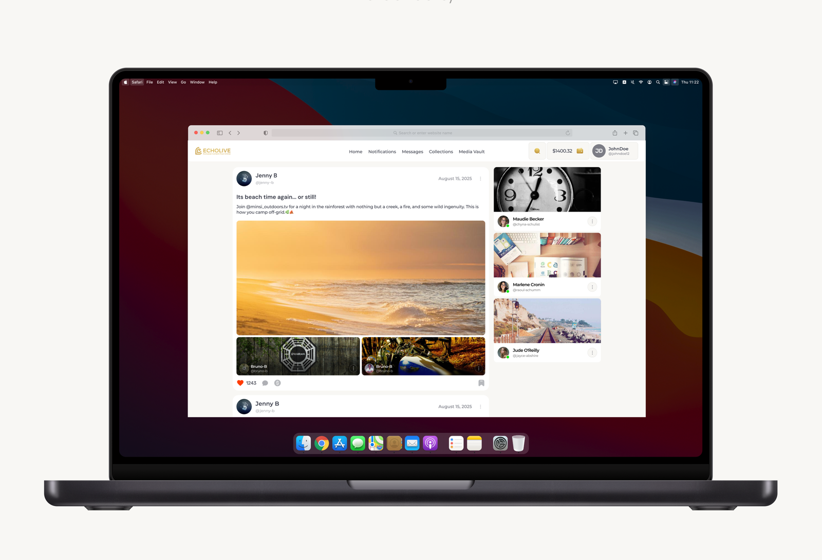
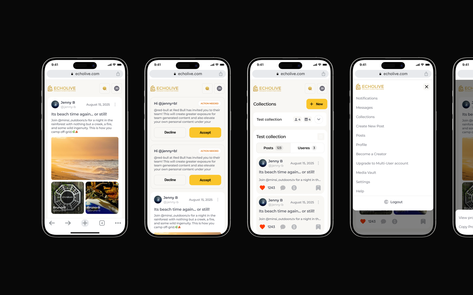
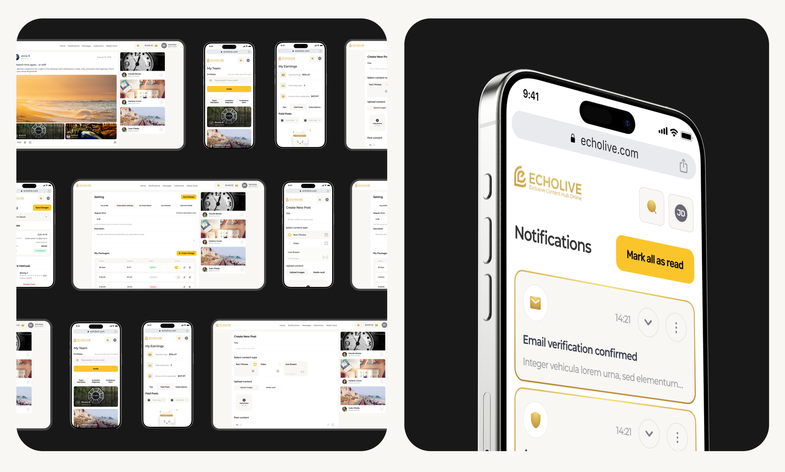
We redesigned key screens and flows—feed, collections, media vault, and user interactions—focusing on clearer hierarchy, reduced cognitive load, and more predictable layouts. Wireframes prioritized fast scanning, consistent patterns, and smoother transitions between sections.
-
UX Research
Based on audit findings and user behavior analysis, we reworked the information architecture and key user flows. We mapped how users create, organize, discover, and interact with content—optimizing paths to reduce friction and improve overall task efficiency.
-
Moodboard
We defined a clean, neutral visual direction with warm tones and soft UI elements to support long sessions and content-heavy views. The mood emphasizes focus, clarity, and approachability, allowing content to remain the primary visual element.
-
Design Concepts
We explored concepts centered on modular layouts and content-first design. The final direction balances functionality with simplicity—highlighting social interactions, collections, and media without overwhelming the user.
-
UI Design
We designed a refined UI system with clear typography, consistent spacing, and intuitive controls. The updated interface improves readability, strengthens visual hierarchy, and supports efficient content management—making the platform easier and more pleasant to use at scale.
Research
User Flow
Wireframes
UI Concepts
UI Design
UI kit
Closing
Title
Title
Let`s discuss where you want to get

Book an introduction call
During this call we do a quick intro and discuss your project and its specific needs.